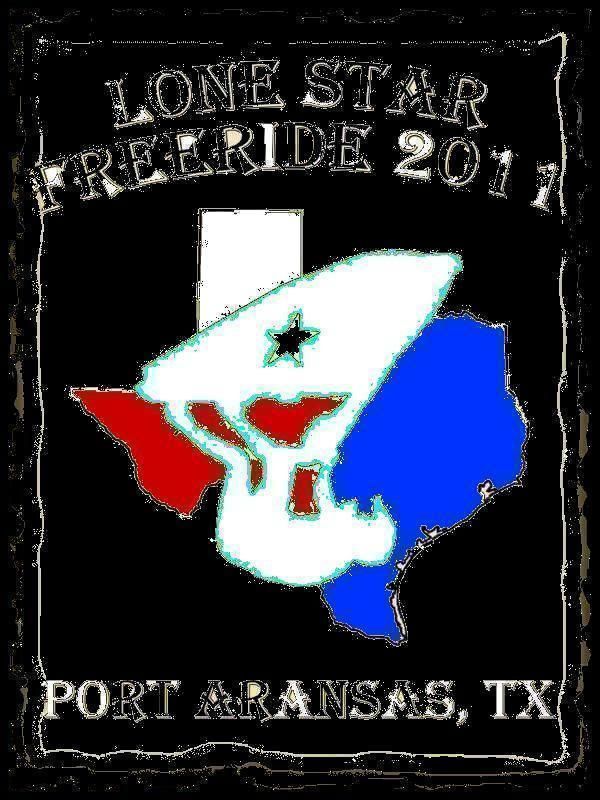
LSFR 2011 Shirts/Hoodies

swapmeet

Brotastic
Location
Arlington TX
EDIT - The font still needs adjustments for spacing (ie the 2011). Before I do that, I want to make sure we want to use this logo and which font. I kind of like the font that Swapmeet is using a little better myself.

I agree, that was just a font that was preloaded in my version of PS. If possible i'd like a little more 'tearing' on the edge of the paper, possibly find a brush or something that shows the edge rolling up, kinda like the top left edge of this.


glassgiant-wanted-poster.jpg

Oh, you could do some bullet holes if you have too much negative space... would kinda go with the 'wanted poster' theme.

 

Peter123

C-Note
Location
Houston, TX
Yeah, I think more tearing and a rollup would look good. At that point, I think we might even want the nails in the corner.

If your font is chosen, can you send me the font, or do you want me to send your the PSD file and have you add the font?
 
Ok so i dont have photo shop but this is what im kinda thinking...

All white lettering and what not hope yall get the hint...

lunapic_129660215320387_120.jpg
 

Odd Duck

Jet Vet
Location
DFW, TX
I like where this is headed, but I don't particularly care for the "yellowed" paper look, either. I like the look of the colored logo (except for too much black), but also agree w/Penguin about it looking a bit similar to previous logos. I don't have any particularly brilliant suggestions, though.

Maybe separate the ski from the state outline - leaning a bit more toward the wanted poster effect as an outline only. No yellowed look, just the ragged paper edge on white on the black shirts. White lettering with a state outline a bit off to the side and smaller, so a bit less prominent. Keep the "flag" color blocking in the state outline, maybe. Maybe a starfish as the star on the flag (or ski), hinting a bit more at a beach theme? Sorry, I have no graphic skills. I could pencil draw it, but not "computer" it.
 

Melmack

(Timothy)
Peter,

I think the idea here is for you and others to come up with their own designs. Then we vote on the best one. The wining design gets immortalized on our backs and earns you a free shirt/hoodie. It's not supposed to be design by comity. So, I would take all the suggestions with a grain of salt, and do what you think looks best.

Take a look at the older hoodie threads and you'll see where we've gone with this before. We would like something different this year. You have several good designs so far but don't be surprised if someone else comes up with something completely different at the last minute that knocks yours out of contention. I made a few suggestions myself but only intended to give you an idea, not to tell you what to do. If someone else wants to change your design completely, let them do it themselves.

I like where you where going with the wanted poster. I think it would grab peoples attention and make them more likely to actually read the shirt.
However, others don't care for it. So, stick with what you think looks best.

We still have several weeks left to get this design together. keep these ideas coming!
 
Last edited:

swapmeet

Brotastic
Location
Arlington TX
Peter, thanks for listening to my input. I can't think of anything better than your wanted poster, but i'm glad I could help offer some suggestions that you liked.

I think its a winner!
 

chad

I pretty much love beer
Site Supporter
On the fence about the cowboy hat...iam not a cowboy.. but what about if the rider was holding in his hand . Kinda like a bull rider.. just an idea... Peter. I like your designs
 
Top Bottom