T-Shirt design contest

Status
Not open for further replies.
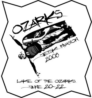
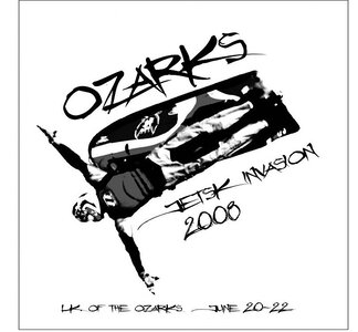
created using Adobe Illustrator 8.0
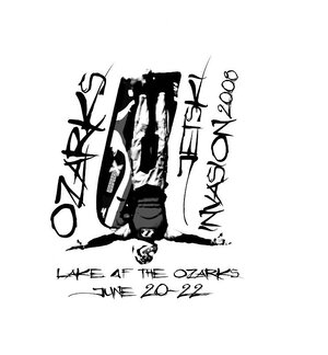
it's already a vector ready to go to print

I can adjust anything you need if you like it.
color and size of text
color and size of rider
text placement

edit... the I in ski got deleted... I can add it if you decide to use this... he he he
 

Attachments

  • ozarks logo.jpg
    ozarks logo.jpg
    61.8 KB · Views: 46
Last edited:

onesojourner

I use a thumb throttle.
Location
springfield, mo
That is sweet. I think Lake should be spelled out and put Lake of the Ozarks on one line and put the date down below and add the "I" back in. I really like that font.
 

guiness92

▓▓▒▒▒▓▓▓▒▒▒▒▓▓▓▓▓▓
Mark your was awesome, if someone actually made that into a shirt i would wear it. Not sure if I would pay for it, but I would wear it lol.
 
Too boxed in, makes it static.

I like the second angled one (no border). Who knew you were an artist, too?

I'm whatever you want me to be.... all I need is two weeks training..

ha ha ha....


I agree, I don't like the totally inverted one either... looks boxy, like you said... did you notice the O in of???

I'm so clever.....NOT
 

XFT LOU

1 hp./1.83lbs
Location
St. Louis
I like it when the word "jet ski" is used. other wise others don't know what the hell were talking about.
 
Status
Not open for further replies.
Top Bottom