Y
yamaslut
Guest
Hell, I don't know when kids start reading...
You guys are so PG-13....
You guys are so PG-13....
I had the "letter people" in kindergarten. LOL.
I am kinda PG-13 in my old age.
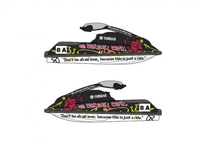
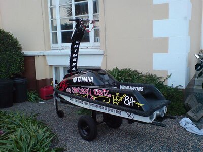
Latest design, no advertising and personal to me. What do you reckon?
I like it, its the best one!Latest design, no advertising and personal to me. What do you reckon?